
Minimalism in Modern Design: Why It Works
Introduction:
After working for 6 years in designing for various Clients, I have realised that there are several examples where minimalism works better. That realization isn’t just personal preference — it reflects broader shifts in how users perceive information, how brands communicate value, and how products compete in cluttered markets. Minimalism and Modern Design together form a powerful combination: Modern Design provides the context and technologies; Minimalism yields clarity, focus, and usability. In this article we’ll explore why Minimalism works better in Modern Design, unpack the principles behind it, show strategies and examples, and give you actionable tips you can apply today.
Why Minimalism Matters in Modern Design
Minimalism isn’t just “less stuff.” It’s a deliberate design philosophy that reduces noise to increase meaning. When paired with Modern Design — which emphasizes clean layouts, responsiveness, and user-centered interactions — minimalism becomes a tool for stronger communication and better performance.
The psychological basis of minimalism
- Reduced cognitive load: Fewer elements make it easier for users to focus on what matters.
- Faster decision-making: Clear visual hierarchy helps users take action quickly.
- Perceived quality: Simplicity often signals modernity, trustworthiness, and premium value.
Market and environmental reasons
- Mobile-first world: Smaller screens demand clarity and prioritization. Minimalism adapts naturally.
- Content overload: In an era of endless feeds, minimal designs stand out by not adding to the noise.
- Performance & accessibility: Fewer assets, simpler layouts, and clearer contrasts improve load times and accessibility compliance.
Core Principles of Minimalism in Modern Design
Minimalism follows a set of repeatable principles which, when applied thoughtfully, enhance both aesthetics and function.
Principle 1 — Purposeful simplicity
- Keep only what matters. Each element must have a reason to exist.
- Ask: Does this improve comprehension, navigation, or conversion?
Principle 2 — Strong visual hierarchy
- Use typography, scale, and spacing to guide the eye.
- Examples:
- Large headline, medium subhead, small body copy.
- Contrasting weight to separate call-to-action from supporting text.
Principle 3 — Generous use of negative space
- Negative space (white space) is not empty — it creates breathing room, highlights content, and improves legibility.
- Benefits:
- Increases focus on CTAs.
- Improves scanning behavior.
Principle 4 — Limited color palette and purposeful contrast
- A restrained palette (2–3 primary colors) creates cohesion.
- Use contrast to call attention: a single accent color for CTAs works wonders.
Principle 5 — Function-first microinteractions
- Minimalism does not mean static. Subtle microinteractions (hover states, smooth transitions) enhance usability without clutter.
- Examples: soft fade-ins, micro-delays to show affordances, simple progress indicators.
Strategies to Implement Minimalism in Modern Design
Whether you’re redesigning a website, app, or brand identity, these strategies will help you adopt Minimalism without losing personality.
Strategy 1 — Audit and prioritize content
- Inventory all content and interface elements.
- Mark each item as: essential, supportive, or removable.
- Remove or collapse items marked removable.
Practical tip: Create a “minimum viable page” — the version of the page that contains only the core content and primary CTA.
Strategy 2 — Embrace modular design
- Use reusable components (cards, buttons, grids) so each component is purposeful and consistent.
- Modular systems make it easier to scale minimal designs across platforms.
Strategy 3 — Mobile-first responsive layouts
- Start designing for the smallest screen; let simplicity guide the expansion to larger screens.
- Prioritize content blocks and fold secondary information into collapsible sections or progressive disclosure patterns.
Strategy 4 — Use typography as an expressive tool
- Choose a strong type scale and stick to 2 typefaces max.
- Use weight and spacing rather than color to differentiate sections.
Strategy 5 — Optimize imagery and iconography
- Prefer single, meaningful images over galleries of generic photos.
- Use line icons or simplified glyphs that match the visual language.
Benefits of Minimalism in Modern Design
Minimalism offers measurable benefits — both qualitative and performance-based.
Faster load times and better performance
- Fewer assets → smaller payload → faster rendering.
- Improved Core Web Vitals: faster LCP (Largest Contentful Paint), lower CLS (Cumulative Layout Shift).
Improved conversion and engagement
- Clear CTAs and reduced friction increase conversion rates.
- Examples of outcomes:
- Higher click-through rates on landing pages.
- Lower bounce rates on product pages.
Stronger brand clarity
- Minimalist branding is easier to recognize and recall.
- It helps brands communicate a single, consistent message: what they do and why it matters.
Better accessibility and inclusivity
- Simpler interfaces are easier to navigate with screen readers and keyboard-only interactions.
- Clear hierarchy improves comprehension for diverse audiences.
Real Case Studies — Minimalism in Action
Below are two real examples where Minimalism in Modern Design created massive impact on performance, trust, and conversions.
Case Study 1 — How Airbnb Increased Trust & Conversions With Minimalism
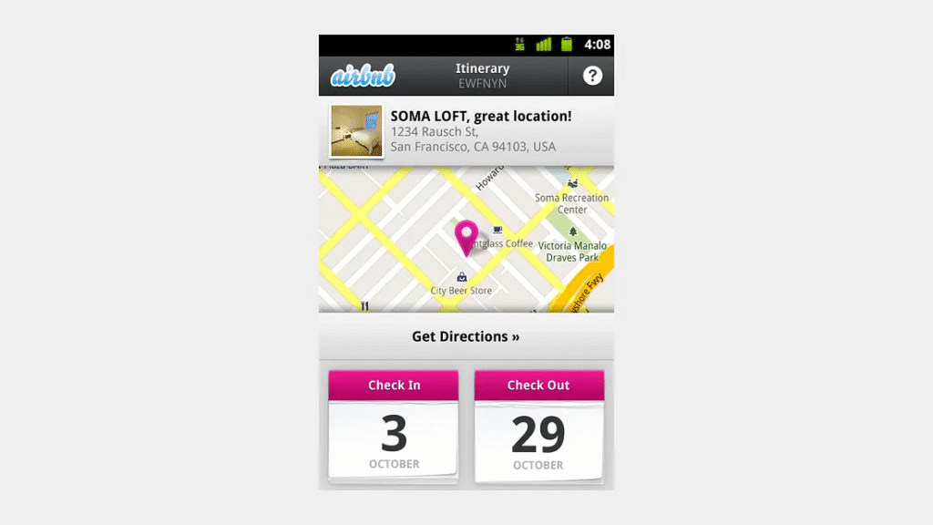
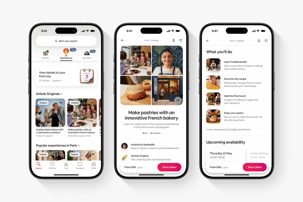
Background:
Airbnb’s old design was cluttered — uneven spacing, busy visuals, and inconsistent UI. As the platform grew globally, users needed faster comprehension and trust.
What They Did:
Airbnb redesigned with strong Minimalist principles:
- Cleaner layouts
- Neutral colors and warm tone
- A consistent typeface (Circular)
- Larger imagery with strong focus
- Clear visual hierarchy
- One primary CTA: Book
- Simpler navigation
The Results:
- Trust scores increased dramatically
- Mobile engagement improved
- Bookings went up
- Brand identity became premium and globally iconic
Why It Works:
Airbnb removed visual noise and built trust through clarity — a perfect example of Minimalism strengthening Modern Design.
H3: Case Study 2 — Google Homepage: World’s Most Successful Minimalist Design
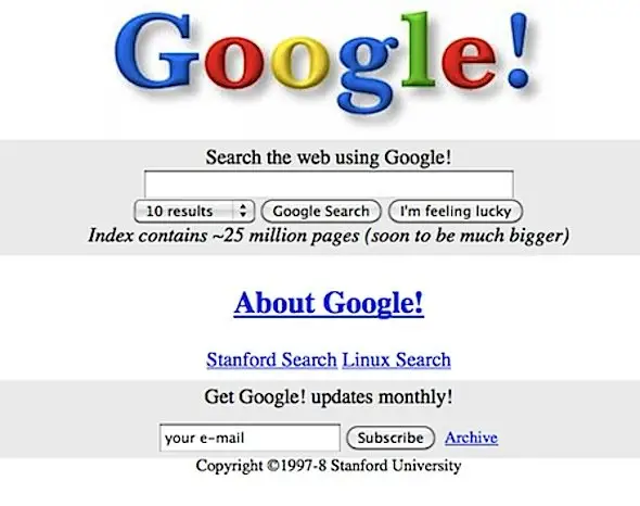
Old Google UI ( 1998, Early 2000s)
The old “Google!” colorful serif logo
- Busy homepage with:
- Index links
- Ads
- Extra tools
- Long blue hyperlinks
- Boxy layout with minimal spacing
- Multiple sections like:
- “About Google”
- “Help”
- “Search the Web Using Google!”
- No refined structure — purely functional
This older version felt experimental and text-heavy.
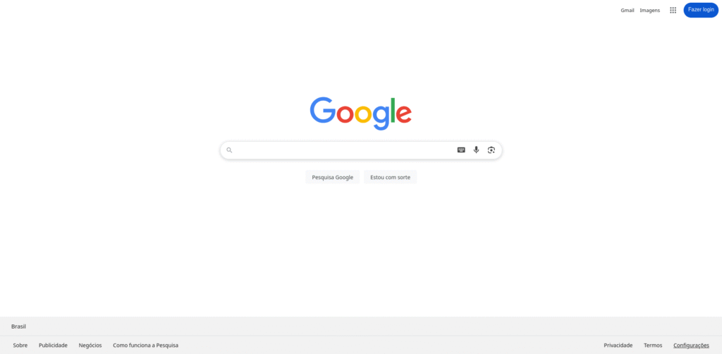
New Google UI (Shown in Your Modern Screenshots — 2020s to 2025)
The current UI includes:
- Flat, simple Google logo
- Huge empty white space
- The central search bar only
- Two clean buttons (“Google Search,” “I’m Feeling Lucky”)
- No extra links, no clutter
- Clean rounded search box
- Subtle shadows and modern calmness
This is Minimalism at its finest: one purpose, one action, one focus.
Why This Design Became Iconic
- Google removed everything that wasn’t essential
- Only the search bar remained — the thing users actually need
- The page loads instantly
- Visually, it feels peaceful, trustworthy, and simple
Actual Impact
- Google became the world’s #1 search engine
- Executes 8+ billion searches per day
- Universally recognized as “the simplest website ever”
- Pages load under 0.5 seconds due to minimal content
Google’s homepage is the global standard for modern minimal digital design.
Tactical Tips — How to Design Minimalism Without Becoming Boring
Minimalism can feel generic if not used carefully. These tips will help retain personality while staying minimal.
Tip 1 — Use meaningful motion
- Soft transitions, parallax sparingly, and animated reveal of key benefits can add life.
Tip 2 — Keep personality through content tone and microcopy
- Conversational microcopy, well-crafted headlines, and human-focused imagery add warmth.
Tip 3 — Use asymmetry and scale
- Break monotony with asymmetric grid placements or oversized headlines.
Tip 4 — Test and measure
- A/B test variations: one minimal version vs. one feature-rich version.
- Track metrics: CTR, form completions, time on page.
Tip 5 — Layer depth with subtle textures or shadows
- A faint texture or a soft drop shadow can create a tactile feel without cluttering the design.
Why Minimalism Helps Search & Accessibility
SEO benefits
- Cleaner HTML structure and fewer third-party scripts improve crawlability.
- Faster pages increase search ranking potential due to Core Web Vitals.
- Focused content reduces keyword dilution — you can rank stronger for your primary terms like Minimalism and Modern Design.
Accessibility benefits
- Clear headings and simple layouts improve screen reader navigation.
- High contrast and larger clickable areas improve usability for motor-impaired users.
Common Pitfalls & How to Avoid Them
Pitfall 1 — Over-simplification (losing functionality)
- Avoid: Removing essential information for aesthetic reasons.
- Fix: Use progressive disclosure; hide secondary info behind toggles rather than removing it.
Pitfall 2 — Personality loss
- Avoid: Minimizing everything leads to sterile branding.
- Fix: Keep voice, imagery, and microcopy distinctive. Minimalism is about clarity, not blandness.
Pitfall 3 — Accessibility neglect
- Avoid: Relying solely on color or tiny fonts.
- Fix: Test with assistive tools and follow WCAG guidelines.
Text & Arts Solutions — Minimalism Done Right
At Text & Arts Solutions, we’ve spent years translating minimalism into measurable business outcomes. Whether you need a brand refresh, a mobile-first website, or conversion-focused landing pages, our services combine Modern Design thinking with minimal aesthetic strategy.
Why choose Text & Arts Solutions?
- Proven results from diverse industries.
- A pragmatic approach: We audit first, design second, and measure continuously.
- Collaborative process with transparent deliverables and timelines.
Ready to simplify and amplify? Contact Text & Arts Solutions for a free consultation and a tailored audit to see where minimalism can boost your product, page, or brand. [Contact Us] (placeholder) — let’s make Minimalism and Modern Design work better for you.
Practical Checklist — Launching a Minimal Design Project
Pre-design checklist
- Inventory all content and interface elements.
- Define primary user goals for each page.
- Choose a 2–3 color palette and type scale.
- Set performance and accessibility targets.
Design & development checklist
- Build a component library (buttons, cards, forms).
- Optimize images and lazy-load media.
- Implement responsive typography and spacing tokens.
- Run accessibility tests (contrast, keyboard navigation).
Post-launch checklist
- Monitor Core Web Vitals.
- A/B test CTA placements and hero copy.
- Collect qualitative feedback via user testing.
- Iterate based on metrics and behavior.
Conclusion
Minimalism and Modern Design are a natural partnership. Minimalism strips away the unnecessary; Modern Design delivers that simplicity across devices, interactions, and contexts. After working for 6 years in designing for various Clients, I have realised that there are several examples where minimalism works better — from faster page loads and higher conversions to stronger brand clarity and improved accessibility. Use focused content audits, modular systems, and careful typography to build designs that are simple yet powerful. When applied thoughtfully, Minimalism in Modern Design doesn’t only look good — it performs.
Want help applying these ideas to your brand? Text & Arts Solutions is ready to translate Minimalism and Modern Design into measurable growth. Reach out and let’s create clarity that converts.